Call Productions Logo
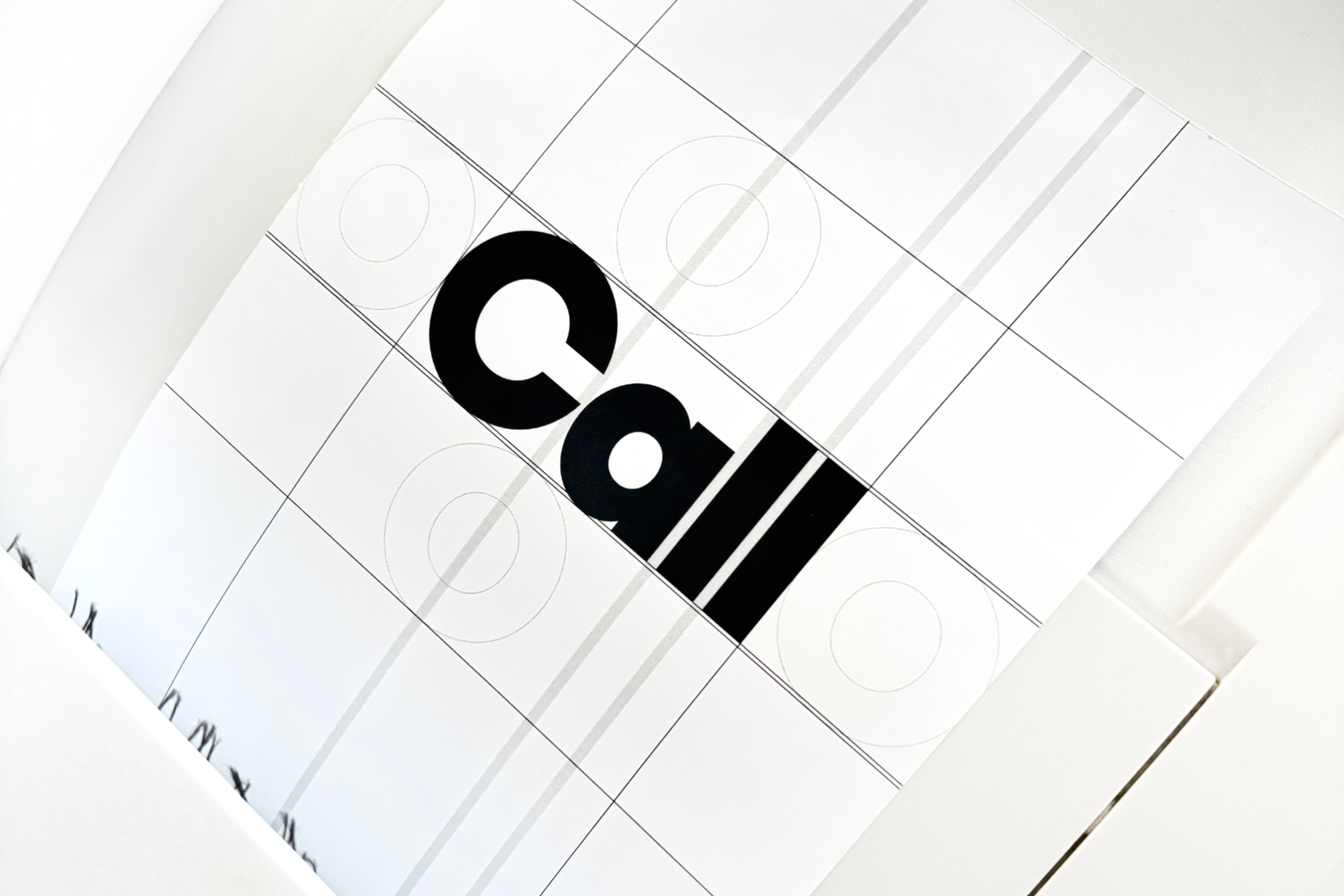
Logo design for the Berlin based film company Call Productions. The design was guided by the desire for a timeless logo with a clear, reduced visual language. The goal was to create a visual identity that convinces through simplicity, is highly versatile, and works equally well across digital and analog formats. The logo was intended to be both striking and restrained at the same time. The chosen version, with its bold line weight, appears confident, present, and stable. It unfolds its full impact in high-visibility applications – such as on the website, in communication, or on products. The lines are intentionally clear and graphic without being overdrawn – conveying a sense of trust, structure, and independence. The design follows the principle of reduction as a conscious focus on the essential. The result is a calm yet distinctive visual identity that is built to last beyond temporary trends.
• Creative and Art Direction: Michael Satter
• Formats: Various
• Typeface: Modern Gothic
• Year: 2025